7 Powerful Color Psychology Web Design Tips to Boost Conversions
If you have ever wondered why certain websites make you want to buy immediately — color psychology web design is the answer. Colors are not just decoration. They are powerful psychological triggers that shape how your visitors feel, trust, and ultimately decide to buy.
The right color on your website can build trust in seconds. The wrong one can send customers straight to your competitor. In this guide, we break down exactly how colors influence customer buying decisions — and what you should do about it today.
What is color psychology web design?
Color psychology web design is the practice of using colors strategically to influence how visitors think, feel, and act on your website. Every color sends a silent message to your visitor’s brain — your job is to make sure that message matches your brand and drives your desired action.
When done right, color psychology helps you guide visitors toward clicking your CTA button, trusting your brand, and completing a purchase — all without saying a single word.
According to research published by the Journal of Management Decision, color is one of the most immediate visual stimuli that triggers an emotional response — often before a visitor reads a single word on the page.
Colors used in web design can increase or decrease conversion rates by up to 24% depending on placement — especially on buttons and call-to-action elements.
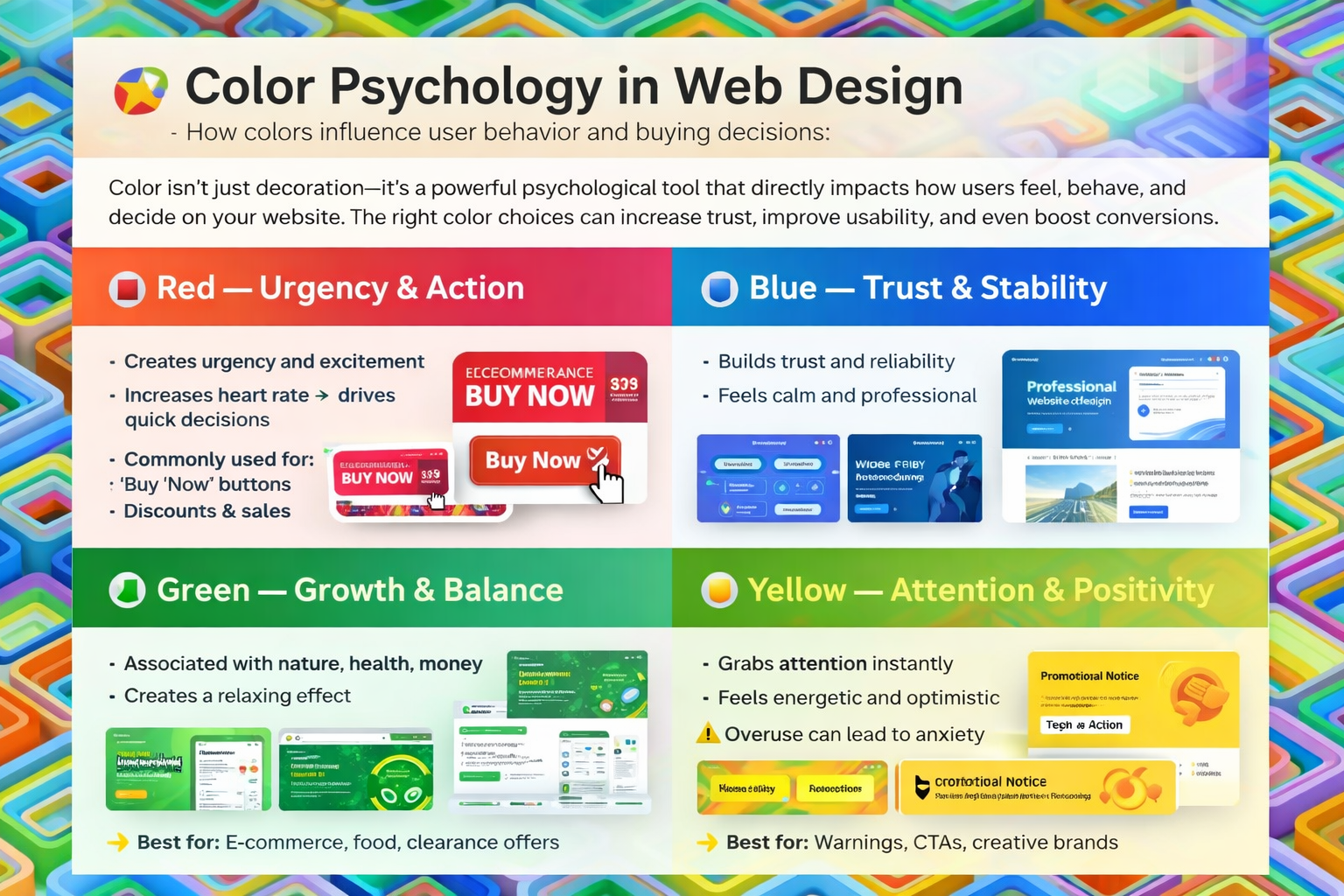
The meaning behind every major color in web design
Let’s look at what each color communicates to your customers — and which major brands use them to drive buying decisions.
How color psychology in web design directly affects buying decisions
1. CTA button color drives clicks
Your “Buy Now,” “Add to Cart,” or “Get Started” button is the most critical element on your page. Studies show orange and green buttons tend to perform best because they create action without feeling aggressive. Red works well for urgency-based offers. The golden rule: your CTA must contrast sharply with its background so visitors spot it instantly.
A well-known HubSpot A/B test found that a red CTA button outperformed a green one by 21% — but this varies with context. Always A/B test your button colors against your own audience.
2. Background color sets your visitor’s mood
White backgrounds feel clean and professional — widely used in e-commerce. Dark backgrounds feel premium and dramatic. Soft pastels feel friendly and approachable. Before picking a background, ask yourself: “How do I want my visitor to feel the moment they land here?”
3. Consistent colors build brand trust
When you use the same brand colors consistently across your website, social media, and packaging, customers start to recognize and remember you. That recognition builds trust — and trust is what turns a first-time visitor into a repeat buyer.
For a deeper dive into how contrast and color accessibility affect usability, the WebAIM Contrast Checker is the industry-standard free tool recommended by accessibility experts worldwide.
Color psychology by industry — what works where
| Industry | Best Colors | Why It Works |
|---|---|---|
| E-commerce / Retail | Red, Orange, Green | Triggers urgency, action, and purchase confidence |
| Finance / Banking | Blue, Dark Green | Builds trust and signals financial stability |
| Health & Wellness | Green, Blue, White | Feels clean, natural, and calming |
| Luxury / Fashion | Black, Gold, Purple | Communicates exclusivity and premium quality |
| Food & Beverage | Red, Yellow, Orange | Stimulates appetite and excitement |
| Tech / SaaS | Blue, White, Dark | Feels modern, reliable, and innovative |
| Kids / Education | Bright mixed colors | Feels fun, playful, and engaging |
Common color psychology mistakes to avoid on your website
- Using more than 3 main colors — it confuses visitors and weakens your brand identity
- Choosing colors based on personal taste instead of your target audience’s psychology
- Ignoring text-background contrast — low contrast kills readability and hurts conversions
- Never testing your CTA button color — a small change here can make a big difference
- Forgetting how colors render on mobile — screens and lighting change how colors appear
- Ignoring cultural color differences — red means luck in China, but danger in Western markets
How to apply color psychology web design principles today
Tip 1 — Define your brand emotion first
Before touching any color, write down one word: how do you want visitors to feel? Safe? Energized? Inspired? Match that emotion to the right color from this guide. This single step prevents most color mistakes.
Tip 2 — Follow the 60-30-10 color rule
Use your dominant color for 60% of the page (background), your secondary color for 30% (headers, sections), and your accent color for 10% (buttons, highlights). This formula keeps your design clean, balanced, and professional.
Tip 3 — A/B test your CTA button color
Split your traffic — show half your visitors one button color, the other half a different one. After 7 days, compare the click rates. The results will often surprise you. This is the fastest way to apply color psychology web design in a measurable way.
Tip 4 — Always check color contrast
High contrast between your CTA button and background makes it pop. High contrast between your body text and background improves readability. Use a free tool like WebAIM Contrast Checker to verify your colors meet accessibility standards.
Frequently asked questions about color psychology web design
What is the best color for a “Buy Now” button?
There is no single best color — it depends on your brand and page layout. However, orange, green, and red tend to perform best across e-commerce websites. Always test with your own audience before committing.
Does color psychology in web design really affect sales?
Yes. Research shows up to 85% of consumers say color is the primary reason they choose one product over another. Small color changes on a website can lead to significant lifts in conversion rates.
How many colors should a website use?
Most professional websites use 2 to 3 main colors. Too many colors create visual chaos and reduce trust. A clean, consistent color palette almost always outperforms a cluttered one.
How does color psychology web design help with conversions?
Color psychology web design helps by aligning your color choices with the emotions that drive purchasing behavior. Using trust colors like blue on checkout pages, urgency colors like red on sale banners, and high-contrast colors on CTA buttons all work together to guide the visitor toward buying.
Should I use different colors for mobile vs desktop?
Keep the same brand colors across both. However, always test how your palette renders on mobile screens — some colors shift in brightness under different lighting and screen settings.
Final thoughts on color psychology web design
Color psychology web design is one of the most powerful and most underused tools available to website owners. Colors influence how customers feel the moment they land on your site, how much they trust your brand, and how quickly they decide to buy.
You do not need to be a designer to start. Begin with your CTA button, your homepage background, and your brand palette. Ask yourself if each color is sending the right message. Small, deliberate color decisions can lead to big improvements in your results.
Now that you understand how color psychology in web design influences buying behavior, you have everything you need to make smarter, higher-converting design decisions starting today.
Want help choosing the right colors for your website?
Let’s build a color strategy that connects with your audience and converts visitors into customers.